
Mobile-first and desktop-first are two different approaches to responsive web design. In this article, we explain what each methodology is, when one method is more suitable than the other, and lastly how to choose between the two.
What is Mobile-First Web Design?
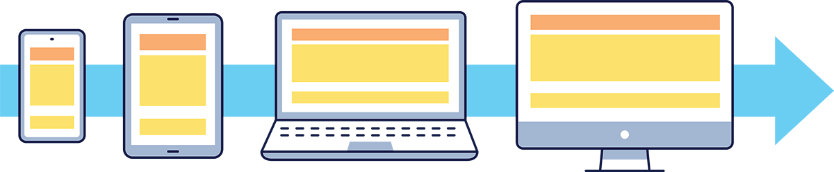
Mobile-first is an approach to web design that focuses on optimizing for devices with the smallest screen first. Gradually increase the user experience’s richness as the intended screen size gets larger. That means that designers usually start with a baseline of what is considered essential for phones, then progressively add more content or functionalities for larger devices such as tablets, laptops, and desktops. This is why this approach is also called progressive advancement.
On a technical level, this is often achieved by prioritizing CSS styling code for smaller screens or using modules that will create different versions of the same webpage for various devices, such as a caching plugin.
Why Mobile-First?
This approach forces designers and developers to think about users’ needs and prioritize content based on the devices they’re on. For example, a mobile user visiting a company’s website is more likely to look for contact information or store hours rather than searching for job openings in the career section or filling out the contact form. Therefore, information related to those two sections should have a lower priority on mobile devices for a better user experience.
Another consideration is that mobile devices generally have slower computing power and network speed than laptop and desktop computers. Not everyone has the latest flagship phones or tablets, and even if they did, they might be limited by the mobile network they are on, especially if they live in rural areas. This means the same webpage may drastically vary load times on different devices. A mobile-first approach to web design ensures mobile devices don’t need to download or process non-essential data, improving overall user experience and preserving battery life. Furthermore, since the page load time is a ranking factor for search engines like Google, doing so can have SEO benefits.
What is Desktop-First Web Design?
Desktop-first design is the opposite approach of mobile-first design. Instead of designing for the small screen first, designers create layouts for large screens and work their way down to smaller devices by reducing content richness, which is why this approach is also called graceful degradation.

Why Desktop-First?
Much like brainstorming, this approach allows designers and developers to start with everything they’d want to implement, slowly removing content or functionalities for devices with smaller screens, less computing power, and slower connection speed. This ensures more options are explored and considered before being removed from implementation.
How to Choose Between Mobile-First & Desktop-First
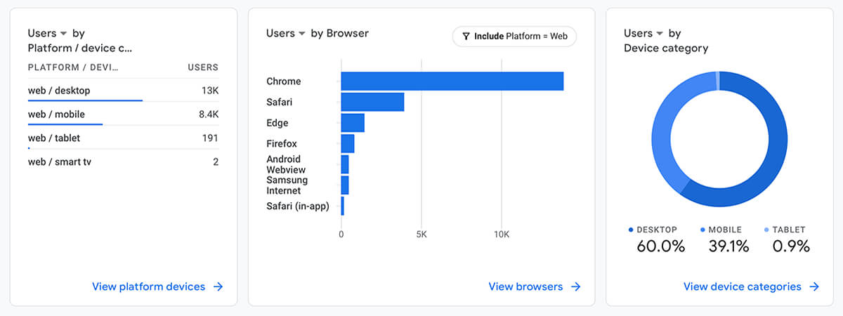
Due to mobile devices accounting for approximately 60% of all Internet traffic, many experts recommend a mobile-first web design approach or claim that it’s the way forward. However, we have designed enough websites to conclude that it depends on the type of website and its intended audience. For instance, a desktop-first approach would be better suited for websites or pages that require a lot of data entry or present a large amount of data. Another example would be B2B websites whose intended audience is business users that work in office settings and are more likely to be on desktop computers instead of mobile devices. When building a new website or replacing an old one, consider the intended audience, use cases, and any available analytics to help make that decision. You can find your website’s traffic profile in Google Analytics, under Platform / Device as demonstrated below.
Summing Up
Mobile-first and desktop-first web design are two different strategies for web design. While both approaches have their merits, it’s important to analyze the needs of the intended users before deciding which approach to take. We are an experienced web design company based in Regina and Kelowna, but we also serve clients across Canada and the US. If you’re looking at revamping your website, but don’t know where to start, hit the contact us button below; we’d love to help.
Mobile-first is an approach to web design that focuses on optimizing for devices with the smallest screen first, then gradually increase the richness of user experience as the intended screen size gets larger. What that means is designers usually start with a baseline of what is considered essential for phones, then progressively add more content or functionalities for larger devices such as tablets, laptops and lastly, desktops. This is why this approach is also called progressive advancement.
Desktop-first design is the opposite approach from mobile-first design. Instead of designing for the small screen first, designers create layouts for large screens and work their way down to smaller devices by reducing content richness; which is why this approach is also called graceful degradation.