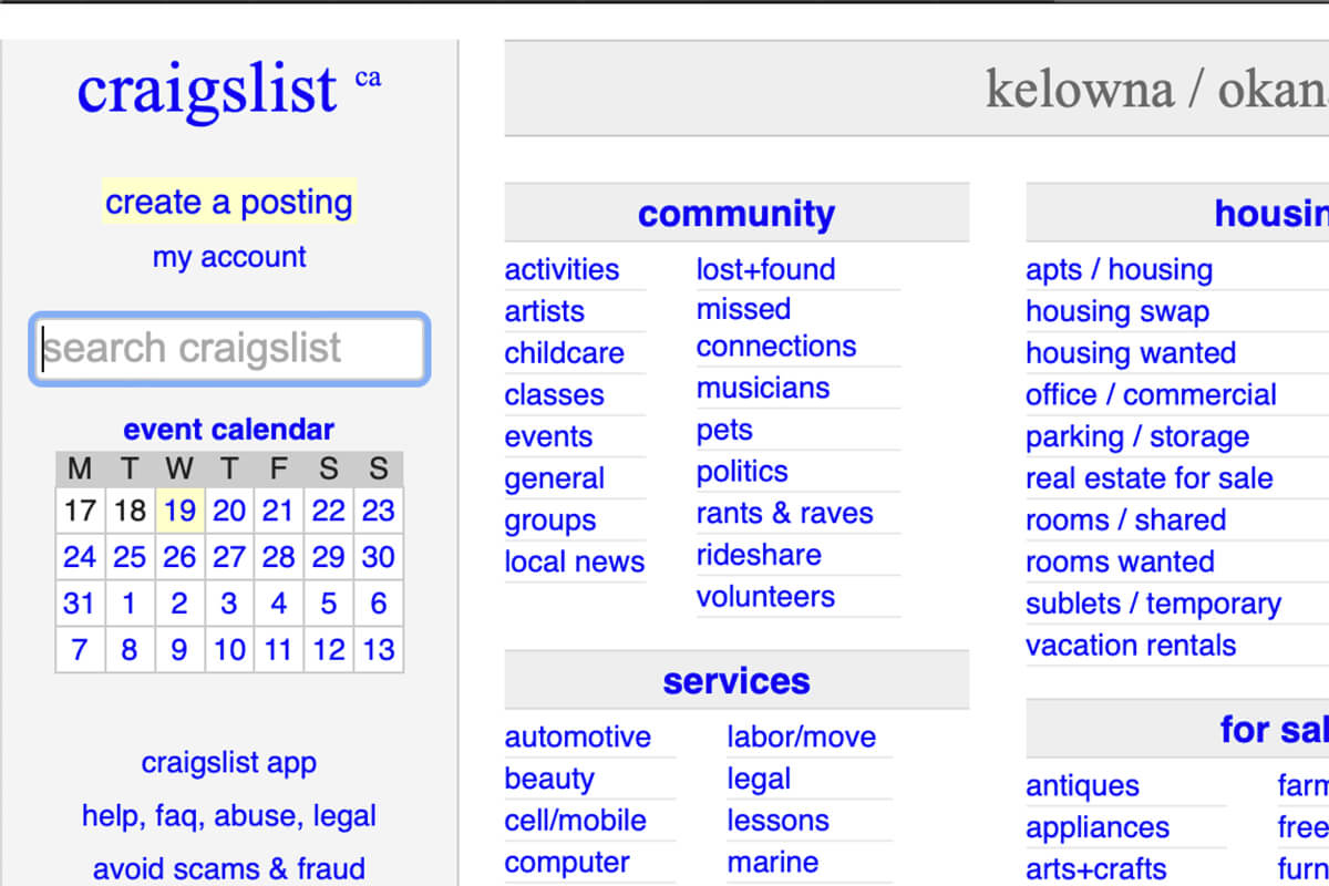
Let’s say you’re a business owner; how do you know if the web designer you hired or are about to hire is qualified and experienced? It’s quite easy, actually. All you have to do is examine the website the designer built and see if you can spot some of these common web design mistakes discussed below.
Page Load Time & Size Not Optimized
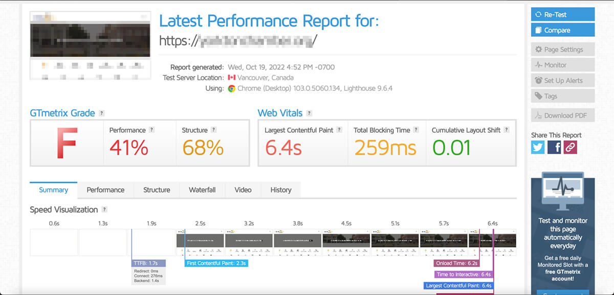
The first thing anyone notices when visiting a website is the load time. There are various reasons for slow page load time, but it’s often an indication of poor web design or an inferior hosting plan. An inexperienced web designer or developer may not know how to optimize the images properly for size or installed a bunch of bloated plugins instead of programming only what is needed. Even if the website is slow due to hosting, a qualified developer should understand the importance of page load time and recommend quality hosting. Regardless of the reason, nobody likes a slow website, and the longer it takes for a site to load, the more likely its visitors would bounce and go to a competitor instead. So if your website loads slowly, it’s time to hire a web professional to have it rectified.
To test load time, go to GTMetrix, and enter the URL. You want the full load time to be under 2 seconds and the largest contentful paint to be under a second unless the webpage utilizes video in the banner.

Not Responsive or Mobile-Friendly
Another way to tell if a web designer is qualified is by examining how the website looks on various devices with different screen resolutions and orientations. One of the most common web design mistakes that inexperienced designers make is not considering mobile responsiveness and also not testing the website on different devices. Mobile and tablet users now represent more than 60% of all Internet traffic, so making sure your website is mobile-friendly should be a priority.
To test mobile responsiveness, simply adjust your browser window by making it narrower to simulate viewing on a mobile device. If anything looks odd, gets cut off, or you have to scroll horizontally, then it’s not mobile-friendly.

Not Visually Pleasing
If a website looks bad, it clearly indicates that the web designer did a poor job. Regardless of how the website functions, humans are visual creatures. When a website lacks good styling, and adequate spacing between elements and the edges of the screen, it’s less engaging and harder to consume. Especially if it hurts the eyes, people won’t stay on for long.
Aesthetic is very subjective, so you can always ask for other people’s opinions.
Lack of Consistency
Consistency means various things here. Is the look and feel of the website consistent with the brand identity? Are the same fonts and colour schemes used consistently throughout the website? Also, are elements on the site modularly designed and re-used on various web pages? Remember, variation is a source of waste; if a web designer isn’t re-using modular components, it’s costing you money and wasting server resources to load unnecessarily code and assets.
To evaluate this, look for consistency in colours, fonts, and layouts.
No Clear Call to Action
Call to action (CTA) is important for encouraging your site visitors to take desired actions, whether it’s to get them to purchase something or provide their information. Even if a website looks good, it will not convert if CTAs are not well thought out, and this is one of the common mistakes web designers make when they are inexperienced in user-interface (UI) design, which leads us to the next point.
Not User-Friendly / Bad User Experience
Even if your site visitors already have the purchase intent when coming to your website, you want to ensure the entire interaction is as easy as possible. Suppose they cannot smoothly complete the purchase process or navigate the information they are looking for. In that case, they may give up and bounce in the middle of the journey, so we don’t recommend hiring a graphic or visual designer to design your website.
If visitors are bouncing or not converting, it could be that your website isn’t user-friendly enough or lacks clear CTAs.
Lack of Accessibility
Ontario is the first province to require certain websites to be accessible; chances are other jurisdictions will follow. According to a 2017 survey, 5.4% of Canadians aged 15 years and older reported having visual disabilities. Unfortunately, designing websites for the visually impaired, especially those who rely on screen readers, is something that many web designers don’t think about or know how to do. It is one of the most common web design mistakes we’ve seen. We know this because several Canadian job boards claim that they specialize in recruiting job seekers with disabilities, but their websites are not optimized for the visually impaired and have failed web accessibility tests; which is why we built Accessibility Worx, a job board optimized for screen readers. Please excuse the shameless plug; we care about diversity and equality.
Besides examining the source code, you can tell how accessible a website is by looking at the contrast of colours, and if fonts are large enough for viewing.
SEO-related Web Design Mistakes
The following points are more related to search engine optimization (SEO), which is understandably an area of expertise most web designers don’t possess. However, a web designer should still know the basics, such as using proper HTML tags, making sure a sitemap is available, and setting up proper redirects and response codes, as these may affect search visibility. So if you’re a business owner, you should have your website optimized from an SEO specialist to give it the best chance at outranking your competitors.
Evaluating whether a site is search engine optimization or not is a bit more involved and requires inspecting the source code. But it’s probably not optimized if your website isn’t bringing in you leads, or if your web designer or developer didn’t mention anything about it, since SEO needs to be part of the web design process.
Summary
After reading this article, you should be able to know if your website was properly built or if the designer you’re about to hire is up for the job. If you’d like qualified professionals to help you evaluate, please get in touch with us for a website audit.


